Insurance Marketplace
Description
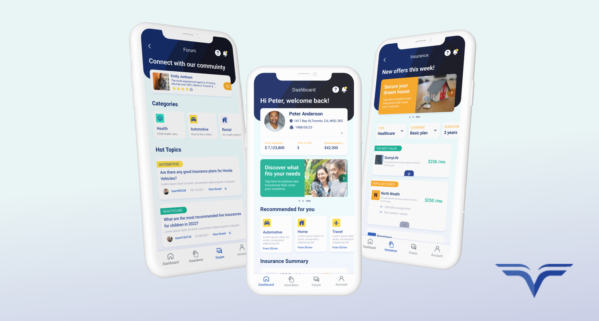
Insurance Marketplace is a mobile app that consolidates policy management, plan discovery, and community advice into a single experience. The redesign is organized around four core destinations: a personalized Dashboard, an Insurance browsing and comparison hub, a community Forum, and an Account area. The central design challenge was making a traditionally dense, intimidating product category feel approachable, so users can check their coverage at a glance, compare new plans with confidence, and access peer and expert knowledge without leaving the app.
Development Process
UX Approach:
The interface uses a clear structural split: a dark curved header frames each screen with its title, a contextual message ("welcome back", "new offers this week"), and quick access to help and notifications, while a light content area below holds all the functional information. This gives every screen a consistent anchor and keeps insurance content from feeling overwhelming.
Content sits on white cards with soft shadows and rounded corners, breaking complex information into small, tappable pieces. A limited color palette does the wayfinding: one warm accent marks actions, category icons, and tags, while a cooler secondary accent handles promotions. Category icons share the same rounded-square format, so product types like Automotive, Home, and Travel are easy to spot.
Typography follows a simple hierarchy: bold section headings, medium-weight card titles, and muted supporting text. The most actionable element always stands out, with pricing given extra visual weight since it drives most decisions. A fixed four-item bottom navigation keeps every core area one tap away.
UI Decision:
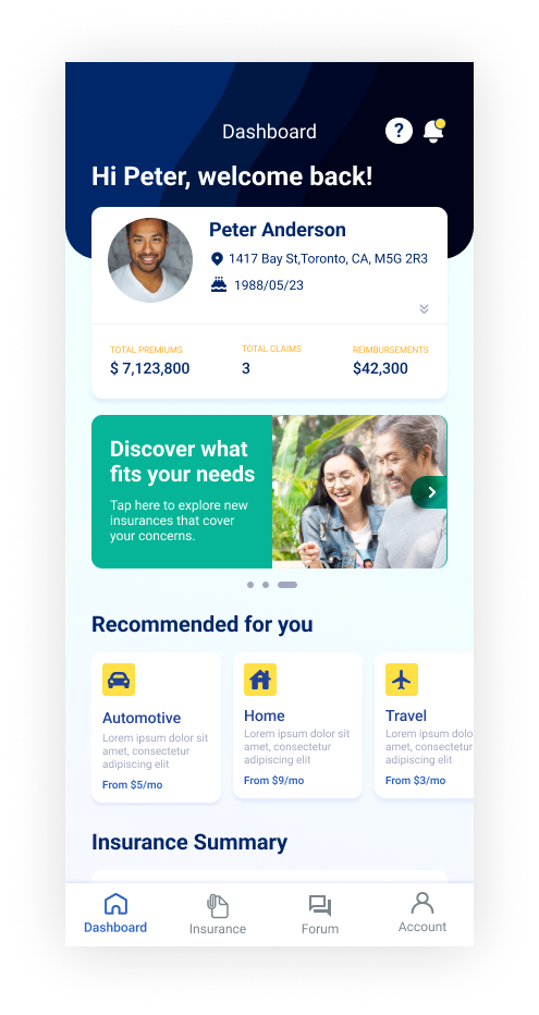
Personalization up font.The Dashboard opens with the user's profile and three key numbers: total premiums, total claims, and reimbursements. This answers "what's my status?" right away, before any product discovery begins. The profile card also collapses via a chevron, so returning users can free up screen space.
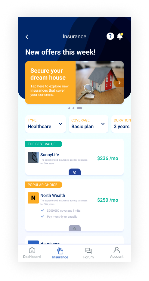
Progressive disclosure for comparison.Each provider card starts compact, showing only the name, a short credibility line, and the monthly price. Tapping to expand reveals coverage limits and payment options. Users can scan many plans quickly, then dig into only the ones that interest them.
Guided filtering instead of open search.Three dropdown filters (Type, Coverage, Duration) with preset defaults replace a blank search bar. This frames the decision around the questions that actually shape insurance pricing and avoids empty results.
Decision support labels.Tags like "The Best Value" and "Popular Choice" give hesitant users a recommended starting point without hiding other options.
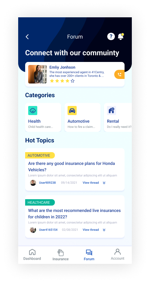
Community as a trust layer.The Forum meets a real need: people want advice before they buy. A verified expert sits at the top with a rating and one-tap call access, followed by browsable categories and Hot Topics threads with color-coded tags. Real questions with timestamps make the space feel active and trustworthy.
Consistency as usability. Headers, cards, tags, and navigation work the same way on every screen, so learning one screen means learning them all. That predictability matters in an app people may only open occasionally.
Gallery